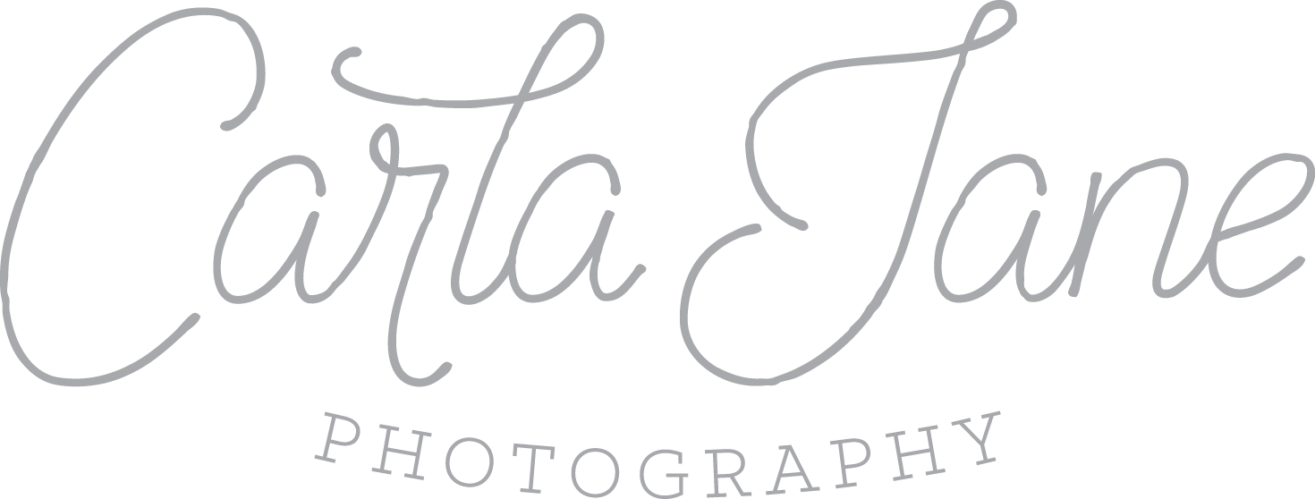
Today is "new brand launch" day. I found that announcing a "new logo" was less appealing, but that's really all this is! I've been refining my brand over the past two years, by growing in my photographic techniques and reinventing the way I connect with future and current clients.
As my first appearance into the blogging world, I hate to make it such an impersonal one, so an official introductory blog will follow soon! For now, all you need to know about me is that I love photographing weddings and people in love, and I happen to also be a graphic designer! As a photographer turned graphic designer, it's so easy to place pretty wedding photos and awesome clients far above my own design needs, so honestly it should be no surprise that this day has been a year in the making. I designed my old logo about a month into design school and while I'm glad to replace it, I think the logo served me well over the past seven years!
I love a logo that doesn't rely on heavy gradients or colorful illustrations to maintain its integrity, which is how I ended up with this monoline inspired hand-lettered logo. As I developed my brand and who I was as a wedding professional, I knew that I wanted a logo that was delicate and soft, while still maintaining a level of timelessness. Some of my favorite photographers that I follow have a calligraphic style logo that is weighted and soft, but I knew that in this fine art photography market I wanted to tote a different logo with a similar mood.
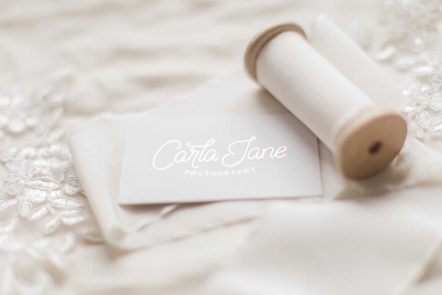
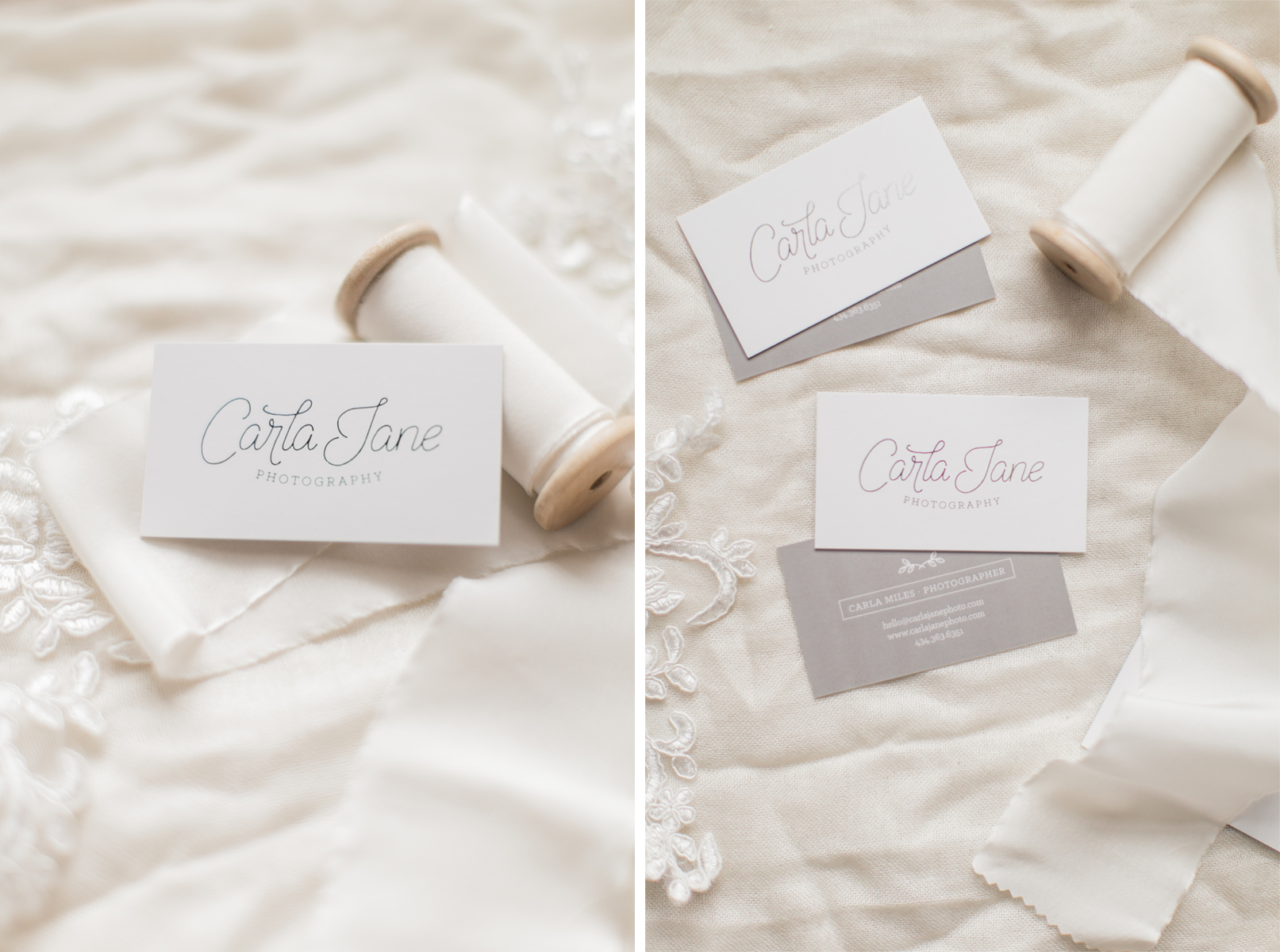
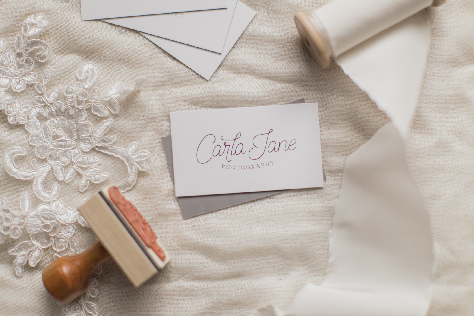
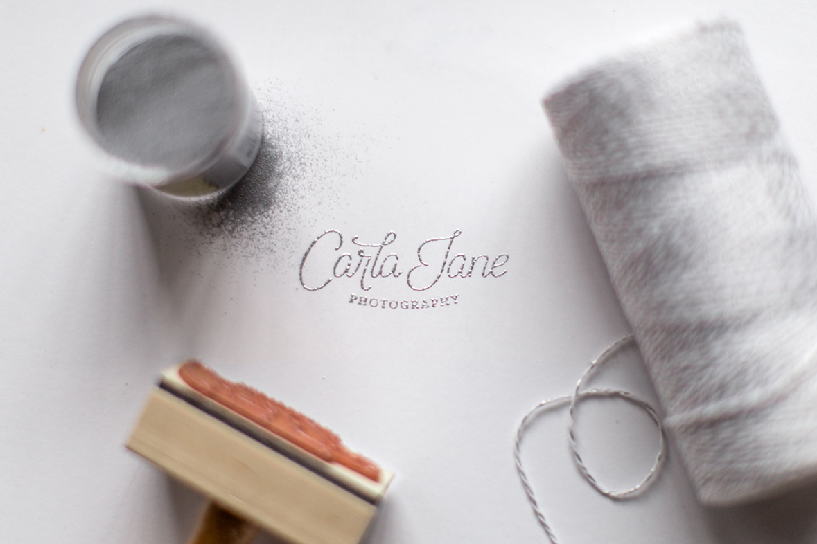
Without further ado, I introduce you to my new logo! I'm excited to have you joining me in celebration on my first blog post, but join in on the fun and head over to my Instagram feed for information about a social media giveaway! But before you competitive spirits rush off, scroll down to see my new silver foil business cards up close, along with some embossing powder fun!
